
In this quick article, we are going to learn what and how to use css flexbox with some use cases of flexbox
What is Css Flexbox?
from the css flexbox specification above, you see that flexbox is a layout model which can be used to lay out the children of a container easily...
Flex Container
The flex container takes the css property and value display: flex or display: inline-flex and it is the box generated by an element with a computed display of flex, children of this container are called flex items
Flex containers are not block containers ( containers that have "display: block" set on them), therefore some properties like:
- float, and clear
- vertical-align
- ::first-line and ::first-letter
Floats and vertical-align css properties do not have any effect on flex items,
<!-- html code -->
<ul class="flex-container">
<li class="flex-item">
Item 1
</li>
<li class="flex-item">
Item 2
</li>
</ul>
<!-- css codes -->
.flex-container {
display: flex;
}
.flex-item {
float: left; // this will have no effect
vertical-align: middle; // this will have no effect too
}
Flex items
<!-- html code -->
<ul class="flex-container">
hello i am a flex item too
<li class="flex-item">
Item 1
</li>
<li class="flex-item">
Item 2
</li>
<li class="flex-item">
Item 3
</li>
</ul>
How many flex items do we have from the above code? Well you might say THREE, but its actually FOUR. Plain text that are not wrapped in any html tag are also regarded as flex items

From the preview(when display: flex; is added to the flex-container) above you see that Four items are laid out side by side, that means anything placed in a flex-container as a direct child is a flex item...
<!-- html code -->
<ul class="flex-container">
<!-- anything placed here as a direct child is a flex item -->
</ul>

<!-- css codes -->
.flex-container {
  display: flex;

}
Some Flexbox Use Cases
Flexbox reponsive header
Flexbox can be used to solve many design problems both complex and simple design problems with a few lines of css, one of this is a responsive website header
take a look at the responsive website header below
See the pen Responsive header with flexbox , by @Spruce_khalifa on Codepen
Flexbox Card component
Lets say you are creating a card component...
<!-- html code -->
<article class="flex-container">
<header>
<!-- card header -->
</header>
<p>
<!-- article content goes in here -->
</p>
<footer>
<h2>
<!-- card footer items goes here -->
</h2>
</footer>
</article>
...and you always want the footer to stay at the bottom, no matter the length of your text... Yep css flexbox can do just that with a single line of code
<!-- html code -->
<article>
<header>
<!-- card header -->
</header>
<p>
<!-- article content goes in here -->
</p>
<footer>
<h2>
<!-- card footer items goes here -->
</h2>
</footer>
</article>
<!-- css codes -->
article {
display: flex;
flex-direction: column;
}
// styles for the header and footer
p {
flex-grow: 1;
}
Check it out on codepen...
you just need to add the flex-grow: 1; to the card content and it will always grow to fill the available spaces
Ordering Elements
Say you want to flip a component, like the Card component we created ealier, you want the footer part to come first and the header to go last, yep flexbox can do that...
<!-- html code -->
<article>
<header>
<!-- card header -->
</header>
<p>
<!-- article content goes in here -->
</p>
<footer>
<h2>
<!-- card footer items goes here -->
</h2>
</footer>
</article>

<!-- css codes -->

// styles for the component
 footer {
  order: -1; // make the footer come first
   }
 header {
   order: 2; // make the header go last
   }
the main thing here is the order property here, the preview should look like this one below

Center An Element
One of the cool things about css flexbox is that you can center an element with ease
<!-- html code -->
<div class="c-card">
<article>
<header>
<!-- card header -->
</header>
<p>
<!-- article content goes in here -->
</p>
<footer>
<h2>
<!-- card footer items goes here -->
</h2>
</footer>
</article>
</div>
<!-- css codes -->
// styles for the component
.c-card {
// some css
display: flex;
align-items: center; // center item vertically
justify-content: center; // center item horizontally
}
and boom that should do the trick...

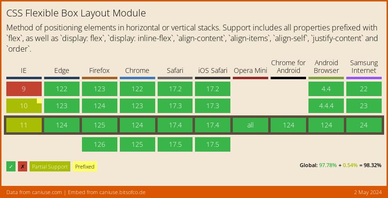
Browser Support
If you want to support older browsers, you should check the browser support level from caniuse.com
Other Resources
again thanks for reading...